Tips and tricks for visualizing data with Matplotlib
Matplotlib is a powerful, highly-configurable visualization library. You can use it for quick exploratory plots or sophisticated figures with custom styling and many components. To get a sense of what is possible, check out their example gallery.
Unfortunately, this library’s flexibility and power come at a cost: Matplotlib can be confusing to use.
One of the most important things to know about using Matplotlib is that there are two distinct interfaces:
- Functional interface (
pyplot), and - Object-oriented interface.
The functional interface is simpler to use but it doesn’t give you as much flexibility. Let’s have a look at some common Matplotlib questions, keeping these two interfaces in mind.
How do I install and update Matplotlib?
First things first: How do I install and update Matplotlib? Matplotlib can be installed with pip:
pip install matplotlib
If you already have Matplotlib installed and want to update to a newer version, you can force pip to update the package using:
pip install -U matplotlib
or
pip install --upgrade matplotlib
This will upgrade you to the latest available version of Matplotlib. If there is a specific version you know you need, you can install that specific version. For example, if you want to install version 3.5.3:
pip install matplotlib==3.5.3
Then you can import Matplotlib to use in your code. The convention is to import Matplotlib as follows:
import matplotlib.pylab as plt
Occasionally, you may need to import a different component of the Matplotlib package, but most of the time matplotlib.pylab will be all you need.
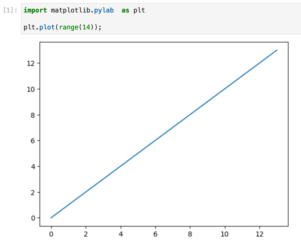
What is the simplest way to create a Matplotlib plot?
The simplest way to create a Matplotlib plot is using the functional pyplot approach:
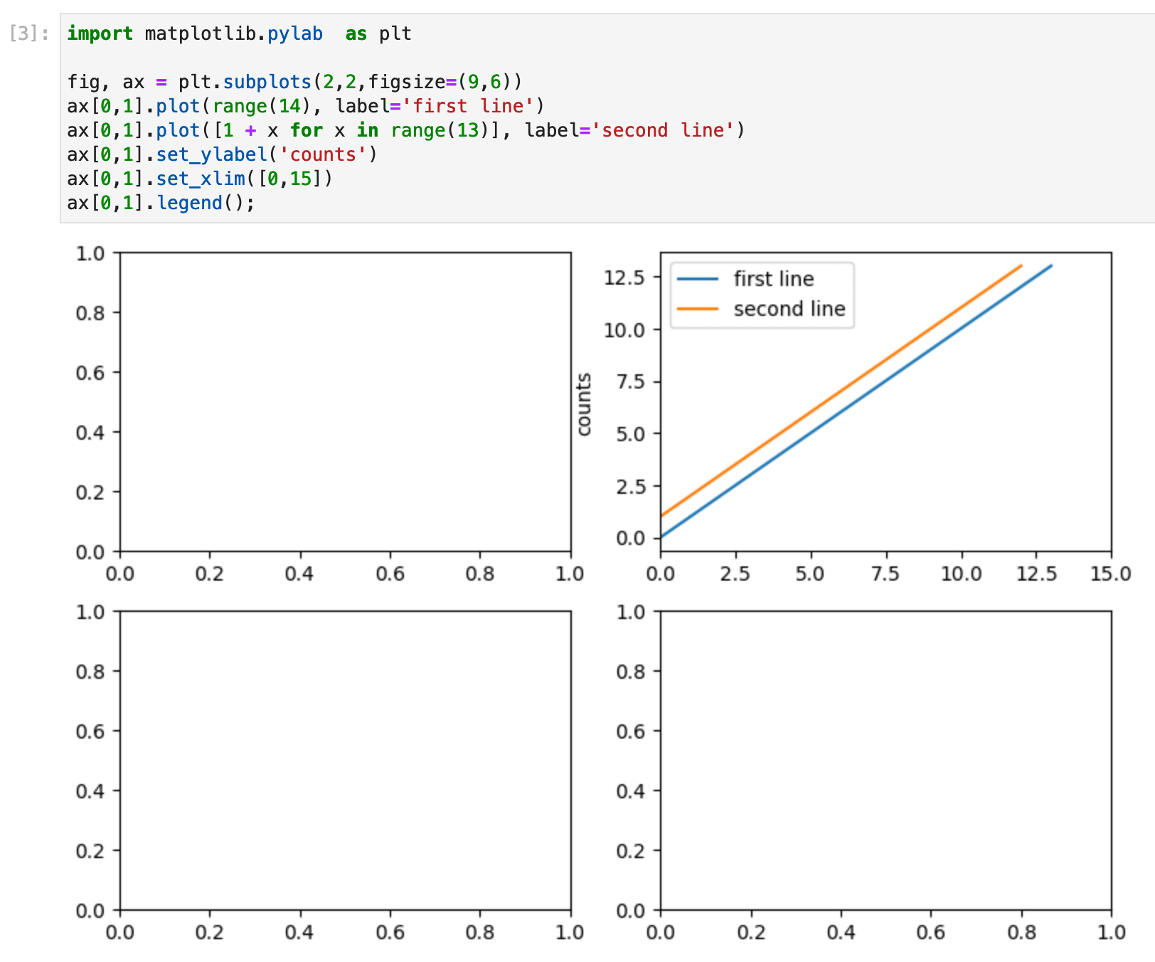
How do I use Matplotlib subplots?
If you would like to create a figure containing multiple subplots, you can use the subplots function.
The subplots function creates two objects: a figure, which acts as the canvas holding all of the plots, and a grid of axes, which you can plot your data onto:
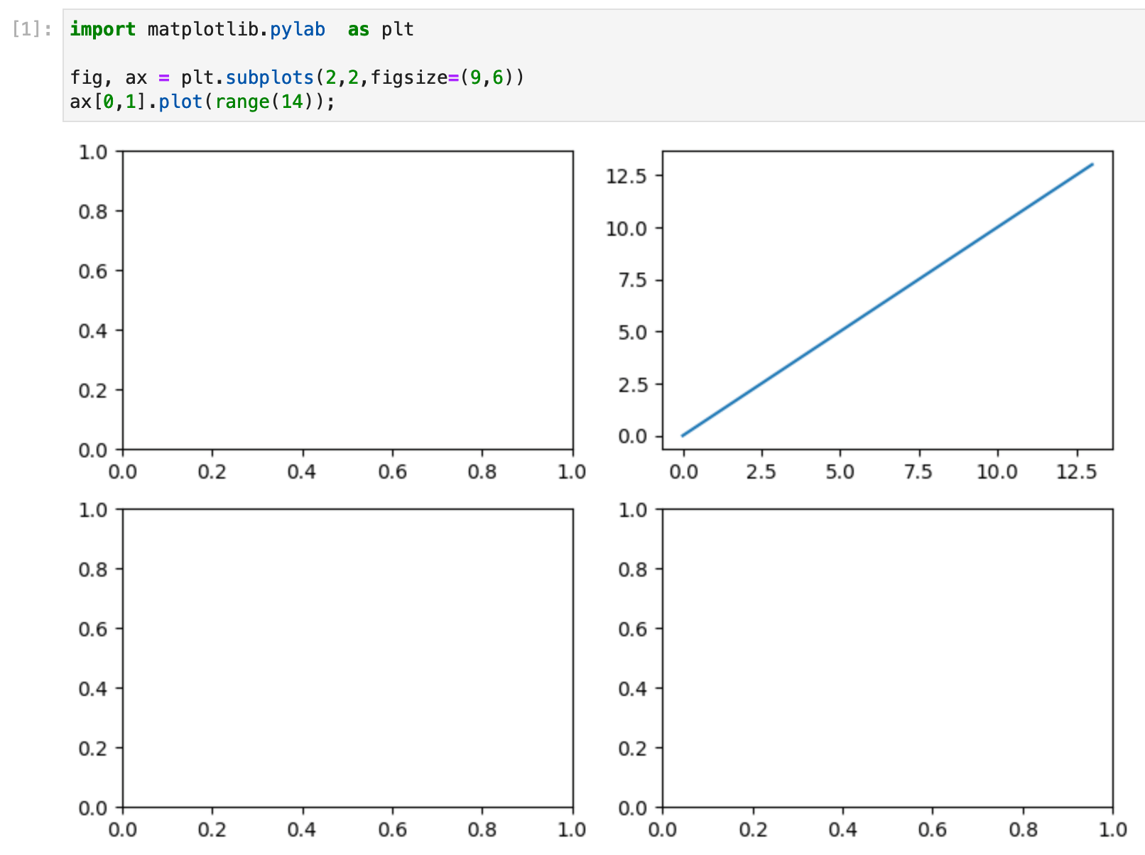
Here we created a figure containing a 2-by-2 grid of axes and plotted a line on just one of the axes. If the figure has more than one plot on it, the axis variable returned by the subplots function is a numpy array with the dimensions of the axes. In the example above, we created a plot on the axis ax[0,1], which is the axis on the first row and second column (using Python’s zero-based indexing).
This method of creating a Matplotlib figure sets us up to use the object-orientated interface because each axis is an object with a suite of attributes and methods that we can then use to modify it.
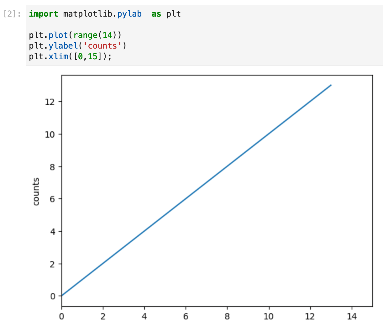
How do I change axis values in Matplotlib?
We’ve created a plot, now how do we configure our axis values?
If you are creating a single simple plot, then you can use the pyplot approach to adjust labels and limits:
If you have used the subplots function to create multiple axes, then you can change the axis values using axis object methods:
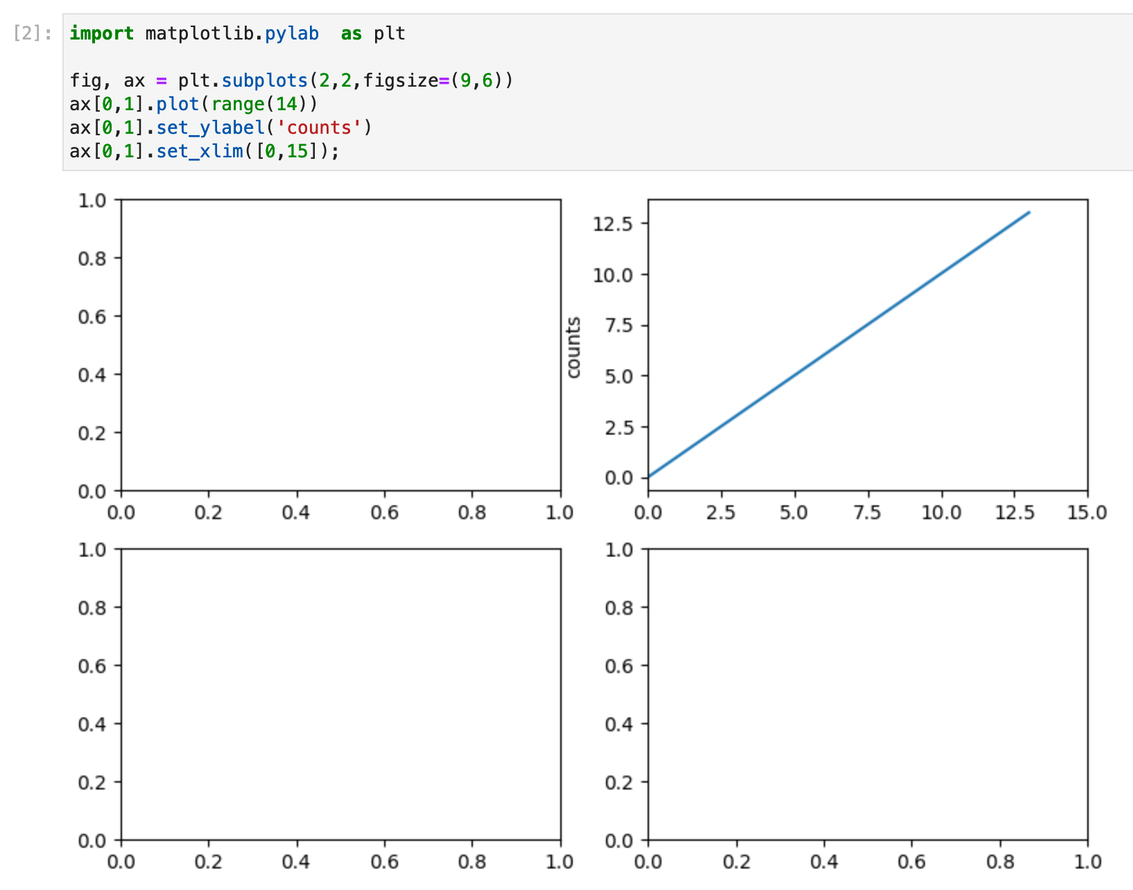
Our axis object ax[0,1] has the associated methods set_ylabel and set_xlim, which you can use to configure the plot.
Axes have many configurable properties, as well as labels and limits. You can find a comprehensive list of configurable properties in the Matplotlib documentation here.
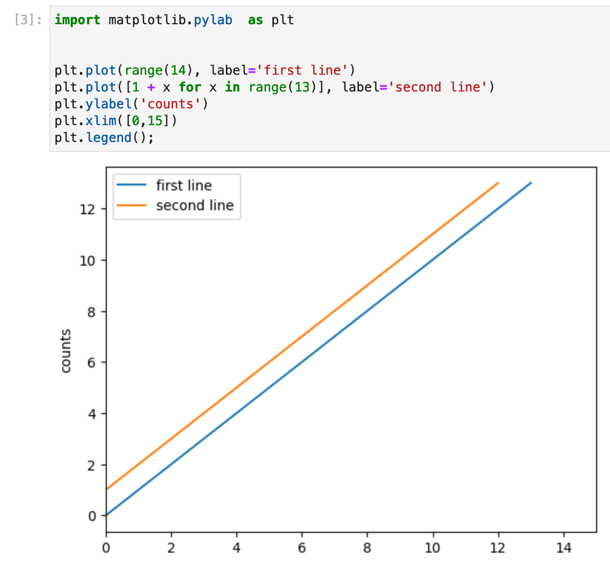
How do I add a legend in Matplotlib?
There are two steps needed to add a legend. First, you need to label each of the plot components with the label you want to see in the legend. Second, you need to create the legend.
In the pyplot method, we add the label to the plot and then call the legend function to create the legend:
The object-oriented subplots approach is similar, but in this case, the legend is created on the axis object:
How do I change the color of a bar chart in Matplotlib?
Changing the color of all of the bars in a bar chart is as simple as setting the color parameter:
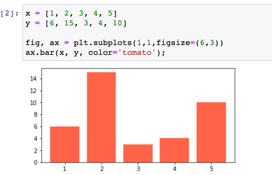
We chose a tomato shade of red. The list of Matplotlib-named colors can be found here.
Notice how we used the subplots command to create an axis with a single figure. The single figure returns an axis object directly, not a numpy array grid of axis objects.
Remember we said at the start of this post that Matplotlib was highly configurable, so surely we can do more with color than just changing our plot to a single, solid color? Indeed, we can!
How about making one of our bars a different color? We can do this by setting the color of each bar explicitly:
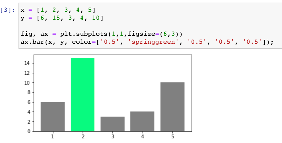
Here we supply the bar chart with a list of colors, one for each bar. We set one bar to be green and the rest to a grayscale value of 0.5.
Another option is to use a Matplotlib colormap to create a gradient of color:
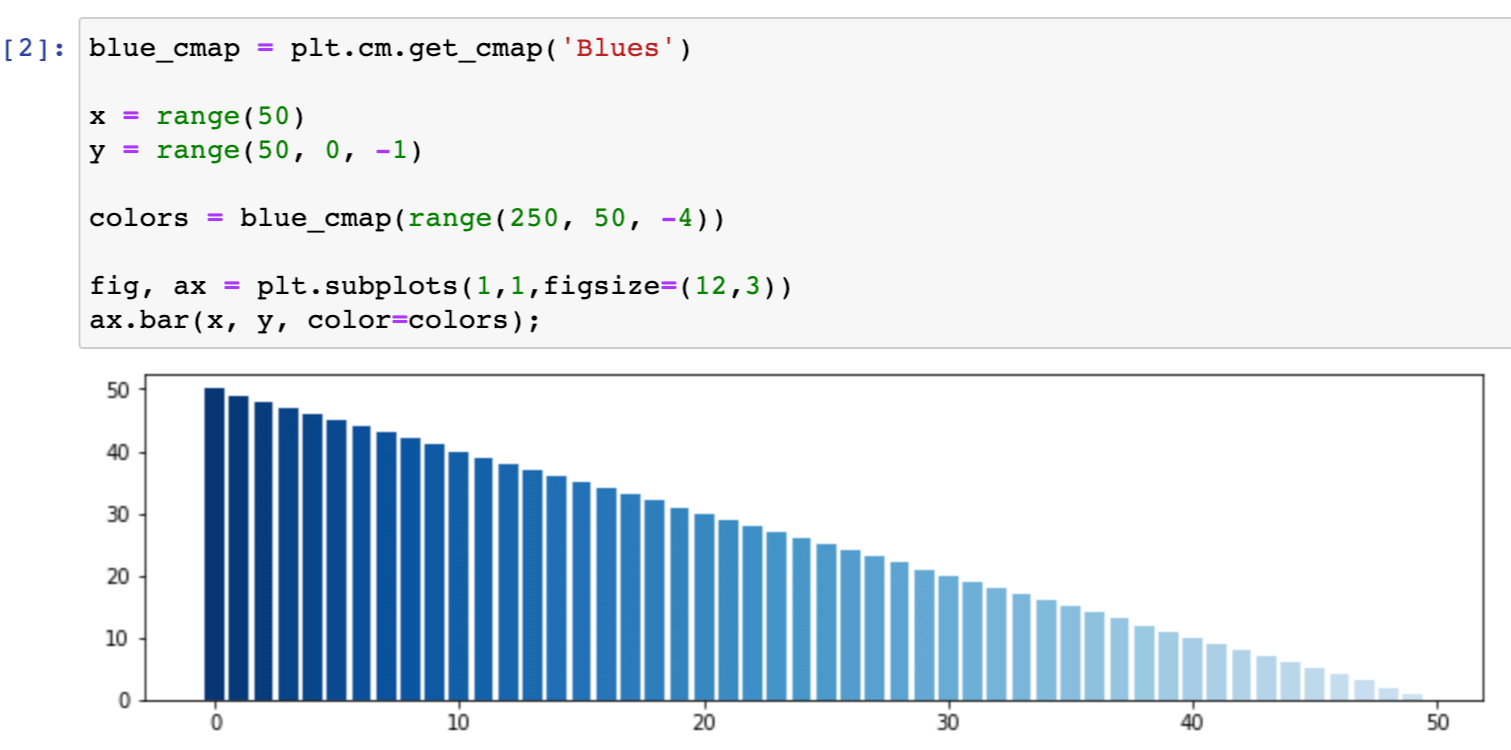
Here we created an array of increasingly lighter shades of blue, using the Blues colormap. You can find more information here about what colormaps are available and how to use them.
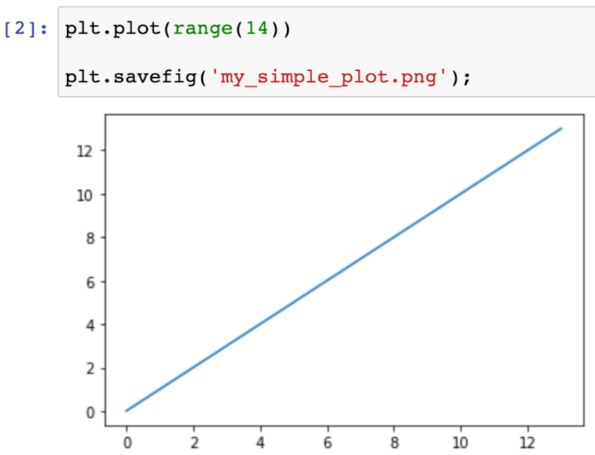
How to save my Matplotlib plot to a PNG?
We can save our plots either using the pylab approach:
Or using the object-oriented approach:
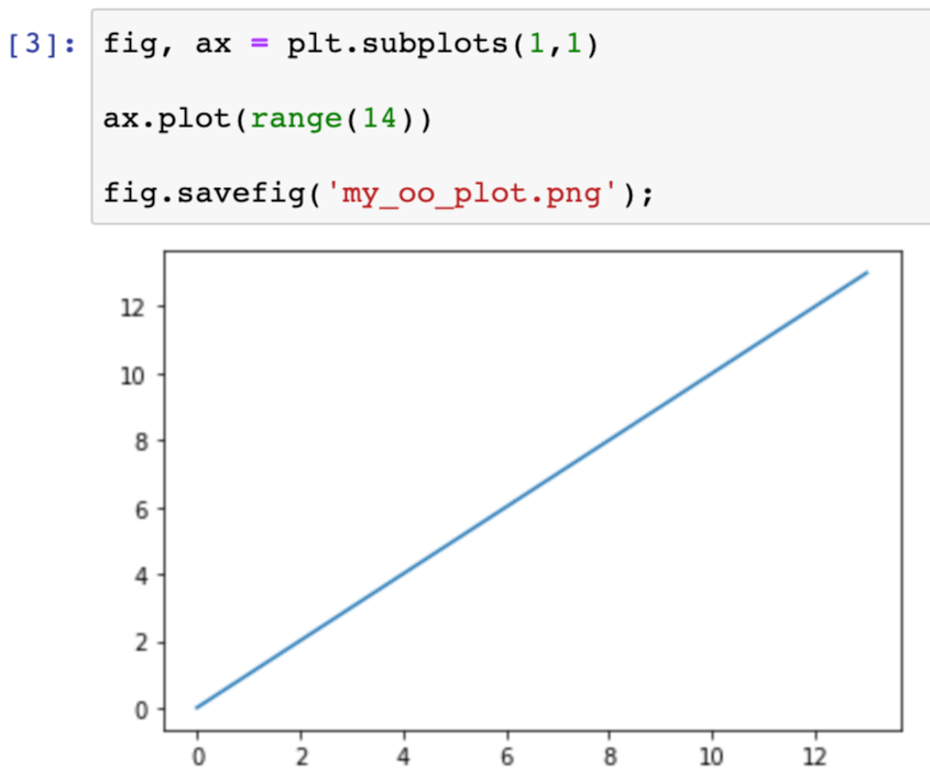
Note that in the object-oriented approach, savefig is a method on the figure object, not the axis object. It is the full canvas that gets saved, not just an individual axis.
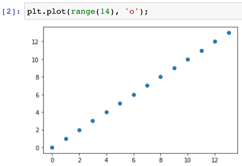
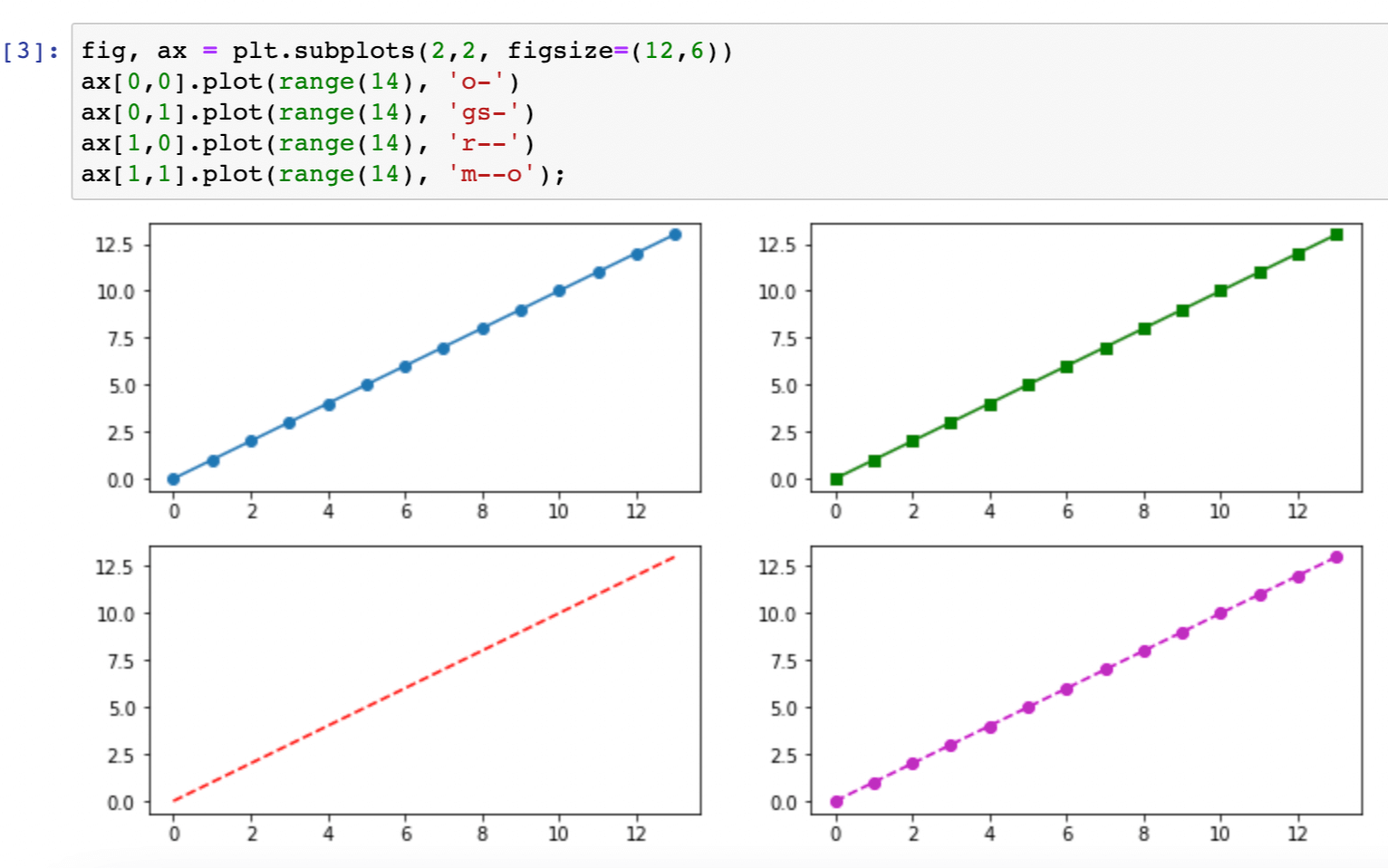
How can I use markers instead of lines in a Matplotlib plot?
The simplest way to change to markers rather than lines in a Matplotlib plot is to take advantage of the third format argument to the plot function. This is a shorthand method to set basic marker, line, and color options. For example, we can change lines to markers in our plot:
We can use the format option to use markers as well as lines ('o-'), to change the line style (e.g. '--' for dashes) or the marker style (e.g. 's' for squares), or to specify the color (e.g. 'm' for magenta):
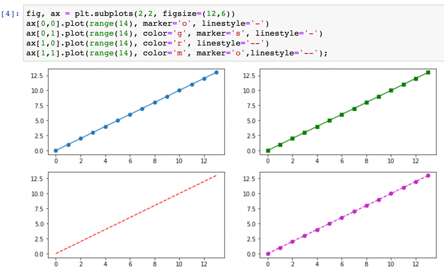
We can also explicitly set each option with its own argument:
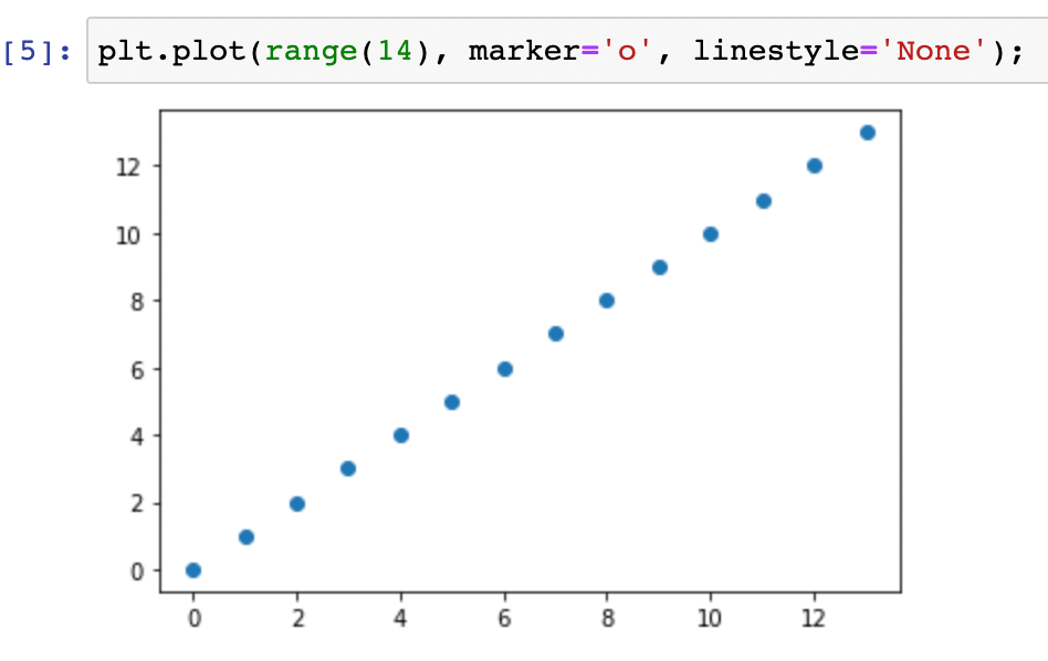
If we are using explicit arguments, we can turn off the line and just use markers by setting the line style to the string 'None':
How can I collaborate on Matplotlib figures?
Engineers and data scientists often use version-control tools like GitHub or Bitbucket to collaborate. Collaboration workflows usually include a code review step in which colleagues review each other’s work and provide feedback. For entirely code-based work, the review tooling provided by version control systems does a great job of enabling these feedback conversations.
But if your work includes visual elements like Matplotlib plots, the existing version-control tooling is inadequate. GitHub does render figures that are part of Jupyter notebooks, and recently it launched rich diffs for notebooks, which includes figure diffs. But you can’t comment on notebooks, so reviewing visual elements is still awkward.
If you want to effectively collaborate on Matplotlib figures, the best option is still ReviewNB. With ReviewNB you can comment on Jupyter notebooks inline, allowing you and your colleagues to discuss all your plots in a single view.